
Goose Goose Duck: Let the duck hunt begin
Joining forces for fun: crafting UI/UX solutions for GAGGLE STUDIOS' hilarious escape game - GOOSE GOOSE DUCK.
About the Project
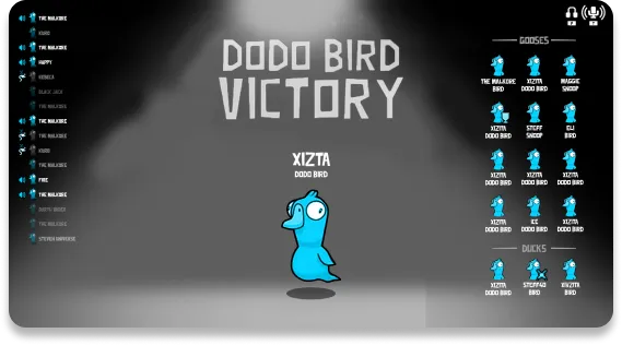
Goose Goose Duck is a hilarious escape game that involves a lot of strategy ! Players dive into the quirky world of the Birdverse and team up with fellow geese in a social deduction game. They work together to complete missions while watching out for sneaky impostors. The size of the game is 5-16 players, collaborating or competing to survive or be the last goose standing! During meetings, deception or honesty could be used to influence the group's decisions, complete tasks or vote out impostors to win. Exploring unique maps with various features and sabotage options, players can sneak through secret passageways to outsmart opponents and secure victory.
Through a comprehensive process spanning UX architecture, style exploration, UI production, and iconography creation, we developed a fully customized treatment for the Goose Goose Duck project. This enhanced the game's visuals and deeply immersed players in the social deduction universe. Our work culminated in a detailed style guide, meticulously documenting values, sizes, and rules to ensure the seamless future use of our designs.
The Challenge
Our task was to overhaul the visual world of Goose Goose Duck, ensuring pixel-perfect consistency across both desktop and mobile interfaces. This challenge demanded that we harness our full range of skills to revamp the entire brand ecosystem. We faced the formidable task of not only creating visually stunning designs but also harmonizing them seamlessly across different devices.
Additionally, we encountered the challenge of designing screens packed with a lot of information. This necessitated the development of a robust set of rules and logic to ensure that every element found its place harmoniously within the interface.

The testing and forming

We began by thoroughly analyzing the project, identifying potential issues players might face during their gaming journey through playtesting. Multiple team members independently conducted this process, noting down observations for each aspect of the game. Subsequently, we convened to brainstorm and categorize these findings, organizing them into distinct sections.
Next, we sought validation for our hypotheses through player testing, as we firmly believe in the effectiveness of a user-centered approach in addressing design challenges. Upon applying this method, we re-evaluated our identified issues and devised a revised plan to address any newly uncovered concerns.
Once we pinpointed the challenges to address, we delved into crafting the game's flow, constructing sketches and implementing enhancements. Numerous screens underwent reconstruction, supplemented by the creation of new ones to enhance the overall user experience. We prioritized key elements and strategically reorganized the design to center around them, ensuring a more intuitive and engaging interaction for players.
Building strong bones
We then created the high fidelity wireframes, based on the previously created sketches. This elevated the design to another level as we formed the elements in a pixel perfect fashion. This set the stage for the UI style polish, which is essentially the next step.
We focused really on the logic and positioning of the elements as there were a lot of condensed screens, filled with information, which had to be re-organized in a very unobtrusive and intuitive manner.
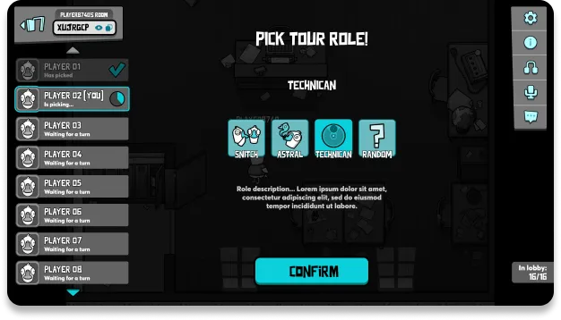
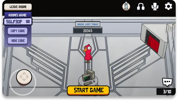
One of such screens was the lobby, where we had to create a seamless sequence of information chunking and presentation for each player. The challenge was to make it in a clear but compact manner, as players in the lobby were a lot more than in games with similar mechanics (e.g. League of Legends).
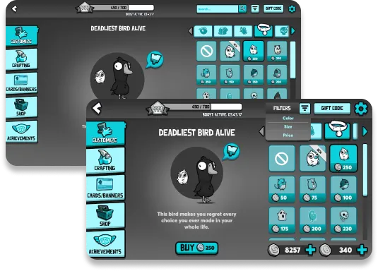
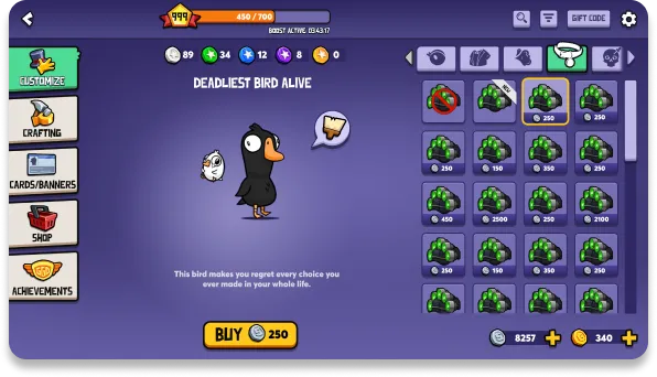
Another was the customization screen within the main menu of the game. There were quite a vast majority of options and informational blocks, that had to be displayed but not interfere with the customization process.
We also had to adapt every screen to both preferred platforms- Desktop and Mobile. This meant that the elements in terms of sizing should be transferred respectively. We adopted the “mobile first” tactic and created the mobile screens first. This ensured that the interactive components are placed in an easily reachable place for the smaller screens. Another reason for this decision is the fact that we wanted to change as little elements as possible for the desktop version, because we wanted players, who wanted to switch platforms, to feel a game that is the same and not wander around the interface.
A process of constant improvement
As we finished forging a robust “design skeleton” , we had to put the clothes on, which is essentially the UI polish process. This covered analyzing the style and theme of the game, which was more casual and friendly looking. As we were adding the treatments for every element, we were always keeping that in mind as a set direction.
We established a clear set of rules for the interactive components which set them apart from the remainder of the UI. This was important because the game itself is quite colorful and vibrant in style, which creates a potential problem of usability.
Our commitment to UI enhancement extended beyond the UX Wireframe phase. As firm believers in continual iteration, we rigorously tested our design decisions and made improvements as necessary. With the mobile version, we faced the challenge of presenting navigation signifiers seamlessly without encroaching too much on screen space. This demanded innovative solutions to present the navigation signifiers and prompts without taking too much of the screen.
Final Strokes
In crafting icons for Goose Goose Duck, we embarked on a meticulous journey, ensuring each icon seamlessly integrated with the game's unique aesthetic. Carefully considering every detail, we crafted multiple iterations for each icon, ensuring they perfectly complemented the game's whimsical style. From playful characters to interactive elements, every icon was thoughtfully designed to enhance the overall user experience. Our dedication to creating icons that resonate with the game's UI style shines through in every detail, adding depth and charm to the interface. As a result, players are greeted with a cohesive and visually appealing experience that immerses them in the world of Goose Goose Duck.
As we concluded the design phase, we transitioned into preparing assets for Goose Goose Duck. Understanding the importance of consistency in future UI component additions, we compiled a comprehensive style guide. This essential document, which includes color coding, shapes, grid systems, and other defining characteristics, serves as a roadmap for future asset creation. By providing clear guidelines, it ensures efficiency and consistency across all elements. These style guides are invaluable in our collaborations, showcasing our analysis and processes while facilitating design consistency throughout the game's ongoing development. They also serve as essential references when our clients seek to expand the game with additional assets, ensuring an easier integration and maintaining the game's cohesive visual identity.
Delivered Value
Our team's approach brought Goose Goose Duck to life, crafting a fully customized treatment that enriched the game's visuals and immersed players in its social deduction universe. We curated a detailed style guide to ensure future use of our designs. Additionally, we successfully tackled the challenge of fitting busy screen information on both Desktop and Mobile platforms, delivering a visually striking and cohesive user interface that captivates players.
Conclusion
Goose Goose Duck has served as a testament to our proficiency in creating multi-platform games with a non-serious yet enthralling visual aesthetic. Our approach to design and development has resulted in a cohesive and engaging experience that transcends platforms, captivating players across Desktop and Mobile interfaces alike. Through this project, we have not only demonstrated our ability to craft immersive gameplay experiences but also showcased our dedication to delivering memorable and enjoyable gaming. As we continue to push the boundaries of game design, we remain committed to creating innovative and entertaining experiences that resonate with players.
We can help you. Just let us know how by filling out the form. We will get back to you in less than 24 hours.